How The Human Eye Influences Packaging Design for Retail & Ecommerce
Packaging is one type of art that has to WORK in a competitive environment. Most packaging design is done on a computer, by itself and chosen by a brand team based on what they find attractive. BUT if we consider how the HUMAN EYE adjusts their attention based on the surrounding elements you will quickly learn that you should design your packaging around this powerful organ.
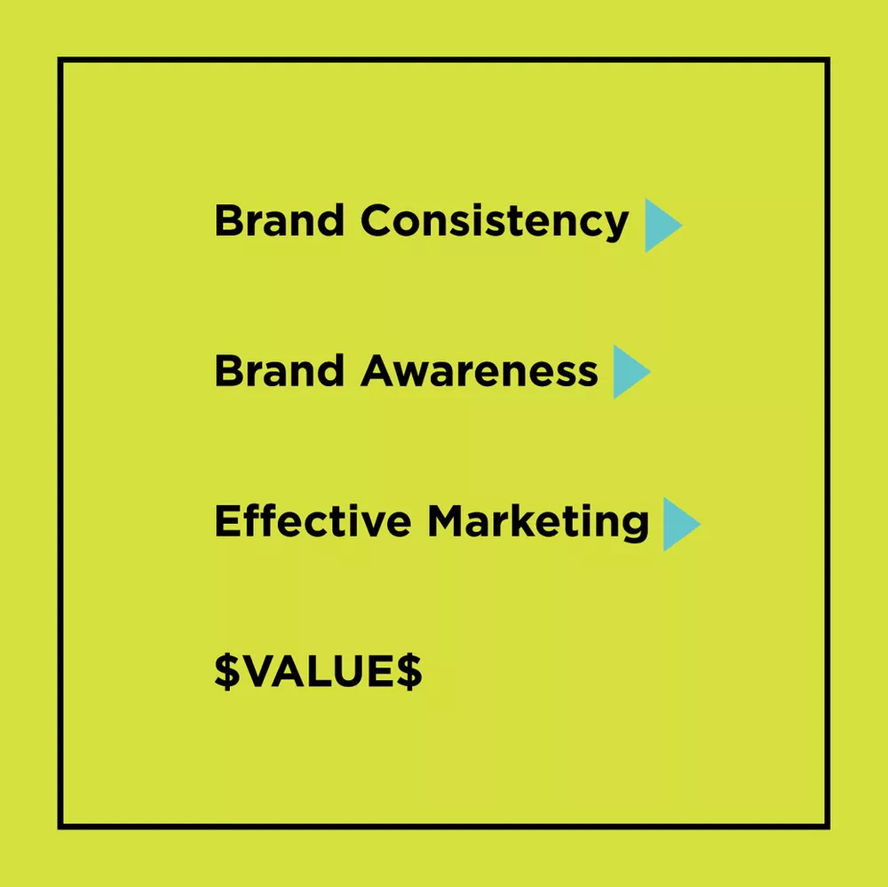
FIRST STEP IN ATTRACTING THE HUMAN EYE – CONSISTENCY
The more a customer can recognize your brand and the more embedded your brand is in their memory (their thoughts AND emotions). Of course the MORE customers think or feel about you brand – the more long term value your brand has.
If you ever plan to sell your company OR if you want to increase sales in stores then you MUST be strategic about building a brand that will increase recognition over time.
The good news is that the most basic tool in your arsenal is REPETITION, something that is literally nearly free and something everyone can do.
THE SECOND STEP IN ATTRACTING THE HUMAN EYE – ANALYZING THE COMPETITIVE SPACE
The other tools you must use (which are harder to create) require STRATEGY related to where you plan to sell your products.
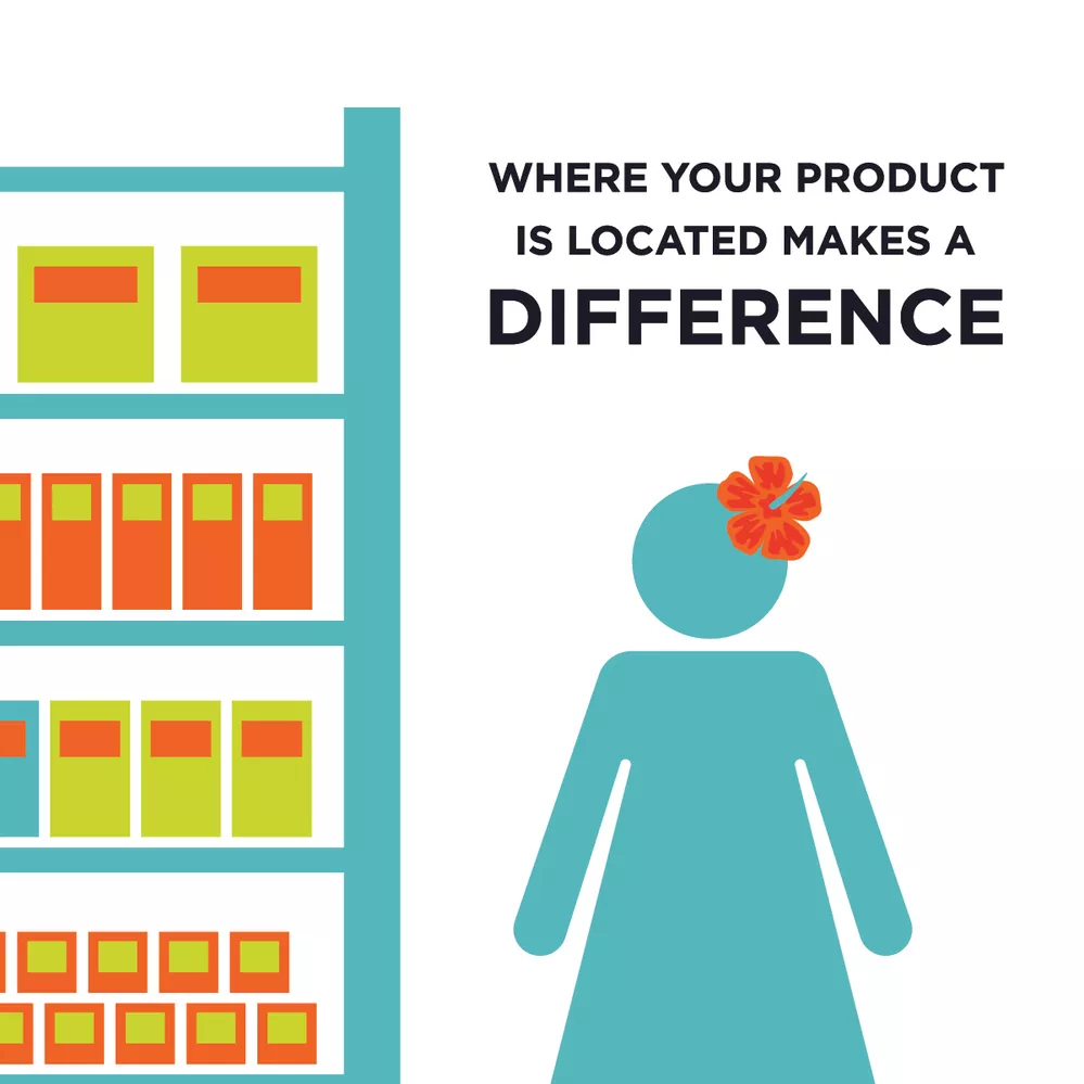
The competitive space on the retail shelf or online search field determines the ability for your brand to stand out.
The way the human brain works is that we comprehend information in a specific order and we prioritize recognition as well! Here is the order of comprehension and significance:
COMPREHENSION:
SIZE > COLOR > SHAPES > IMAGES > TEXT
SIGNIFICANCE HIERARCHY:
Movement > Size >Contrast/Uniqueness > Top to Bottom > Left to Right
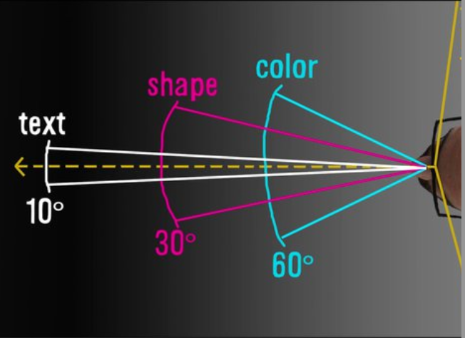
Here is an example you can apply to your own eyes in this moment to prove this point. Take a look at this image below. What do you notice?

In this next image what stands out initially? Do you see anything the longer you look at the image?

In the first image, most people will see the small red dot in the right corner. And then after more focus the will notice a brick pattern in light grey.
These two black images illustrate the cognition that occurs in the brain always depends on things like SIZE, CONTRAST and also LOCATION of the images.
DIFFERENCES OF BRANDING FOR RETAIL VS. ONLINE COMMERCE
This is even more important if your product will be placed in a brick n’ mortar versus e-commerce environment because of where the product is located in front of the human eye.
HUMAN EYE IN BRICK ‘N MORTAR STORES
There are technology companies like Eyeware Tech who demonstrate what shoppers view with eyeglasses that replicate a “heat-map” following the eye retina to see what catches attention. When you track the human eye, you can see here that shoppers actually view things at a 45 degree window in front of their face while browsing.
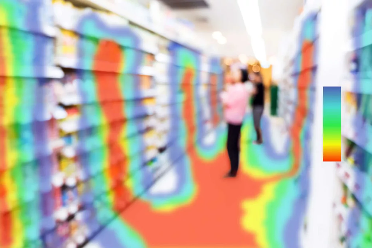
As you can see from this heat map you cannot expect a shopper who is browsing to be staring at your product straight on. This means you must have dramatic packaging that can grab attention from their peripheral view.
The average shopper makes re-peat purchases with 50% of their choices but that means 50% of the other items are impulse buys. This implies if you can capture their attention you can potentially capture more sales.
HUMAN EYE IN E-COMMERCE SHOPPING
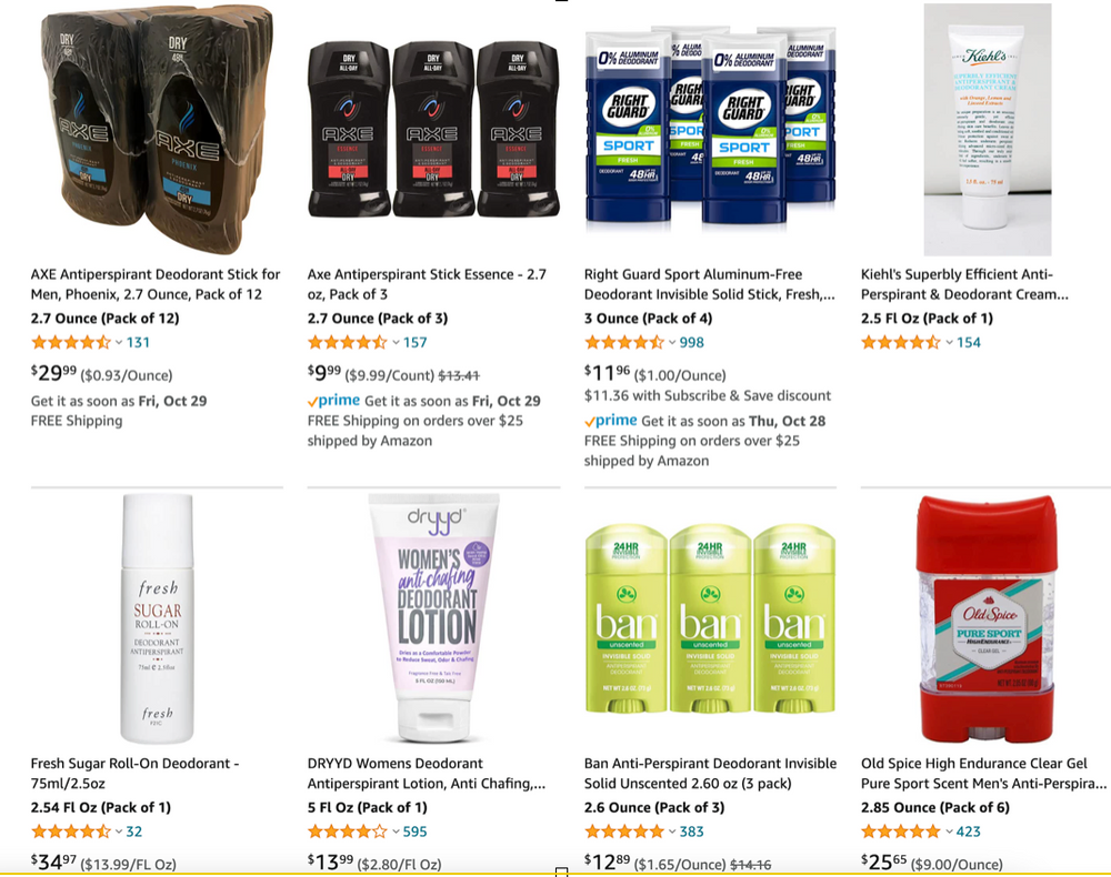
In contrast online shopping (e-commerce) occurs with search results which bring items to the forefront of a shoppers eye and displays items on a white space with other competitors based on KEY WORDS.
You can see from this example of Amazon search results for deodorant that it is important to align images to face straight on with a clean white background. Plus you need to keep the words on the packaging VERY clear so they contrast with white since large companies like Amazon.com or Walmart.com or Google shopping utilize white as the background for search results.
ECONOMICS 101 – BRANDING CREATING LONG TERM VALUE
Branding actually is a scientific tool you can invest in for long term value – not just short term results.
You may remember from your course in economics – and that is the concept of “barriers to entry” which allow you to protect your product and customer base so you can charge a fair price. Branding IS a unique barrier to entry you can create that sets you apart in the market and allows customer brand loyalty to enable pricing that includes profit.
You can watch this 5 minute video to learn more about the ECONOMIC principles that enables your brand to be a powerful tool to build your business and profit.
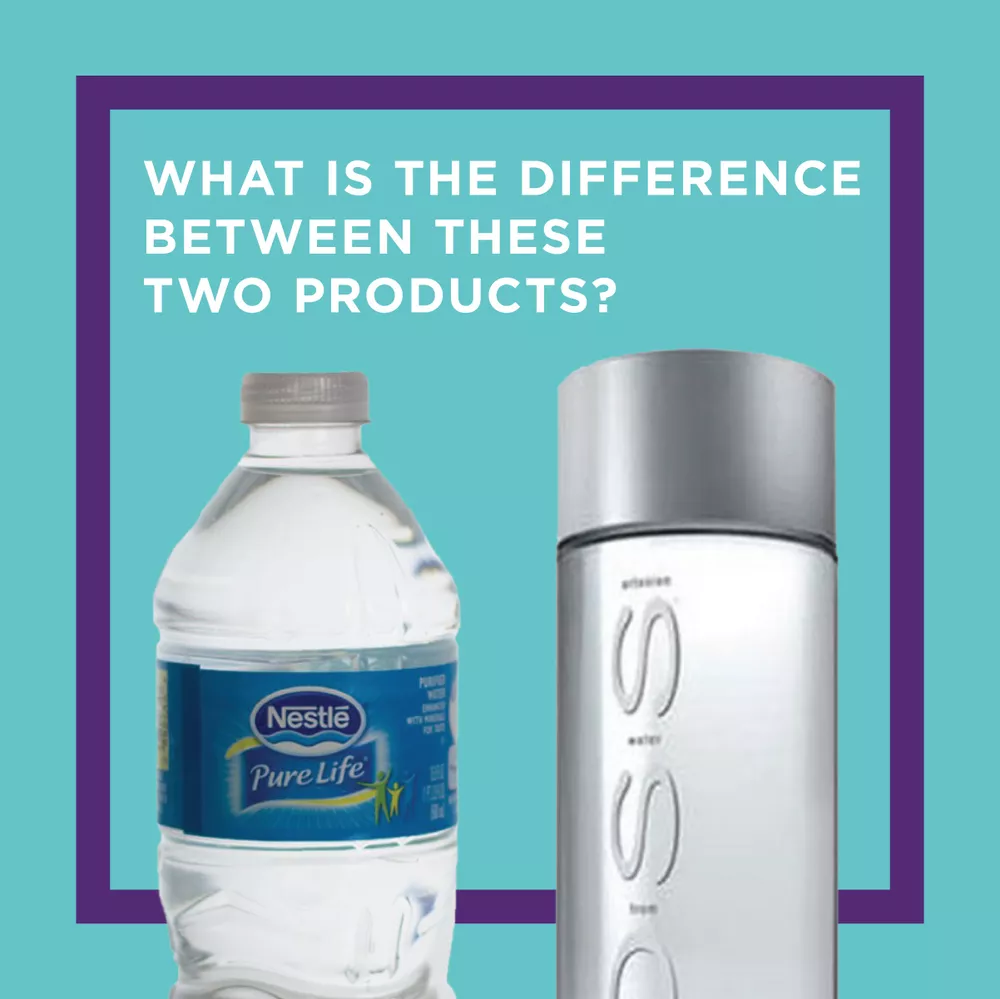
CLICK TO WATCH: https://youtu.be/Hm9vAqEJ5H4
CONCLUSION – APPLICATION TO YOUR BRAND:
What are your next steps to review and up-level your brand?
1) In order to use this information you MUST first review the competitive space where you plan to sell. Your best design will not just be one you personally like but it will be one that stands out on a shadowy retail shelf in a grocery store.
2) Next you must make sure you optimize the space you are allowed on the shelf or in the search image thumbnail – fill the entire allowed space! Use contrasting colors and large shapes to draw attention.
3) Then of course you must define those colors, shapes, images, and text you will REPEAT on all products in order to create brand recognition.
After you identify that you need to make changes – you often need to hire a design agency to help with the finer details. In the beginning of your brand it may not be essential BUT over time you should up-level and re-brand to improve your brand performance as you get into more stores.
If you’re interested in working with Pearl Resourcing schedule your appointment to review your brand and get an estimate: https://calendly.com/pearlemily/learn-more/.
———————————
MORE ABOUT START TO SOLD
Whether it’s packaging, product development, brand design, marketing, manufacturing, distribution, or operations and logistics, you’ll get the in-depth, relevant and actionable advice and resources you need here at the Start to Sold Blog (https://www.emilyannepage.com/StartToSold/) OR YouTube Channel: (https://bit.ly/3cDZS39)
MORE ABOUT EMILY PAGE
Emily is CEO of Pearl Resourcing and has managed and launched multiple 7-figure brands in Costco, Williams-Sonoma, Kroger, and Amazon. She’s bringing you the expertise, resources, and mentors you need so that you can develop products and make them sell. She also offers business growth consulting(https://www.emilyannepage.com) and free advice for brand owners through START TO SOLD (http://starttosoldpodcast.com)
https://www.linkedin.com/in/emilypage/

